A collection for your next celebration
Best 100 Script Fonts for Wedding Invitations: How to Choose the Perfect One
A font is one of the first details we notice on a wedding invitation. Sometimes, just two beautifully written names are enough to convey the mood of the celebration.
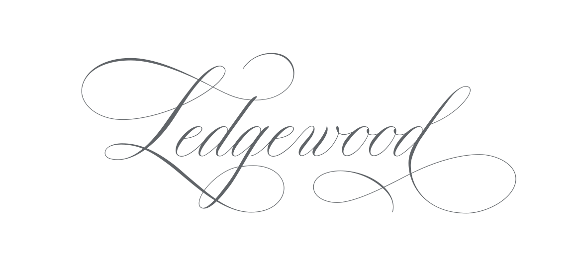
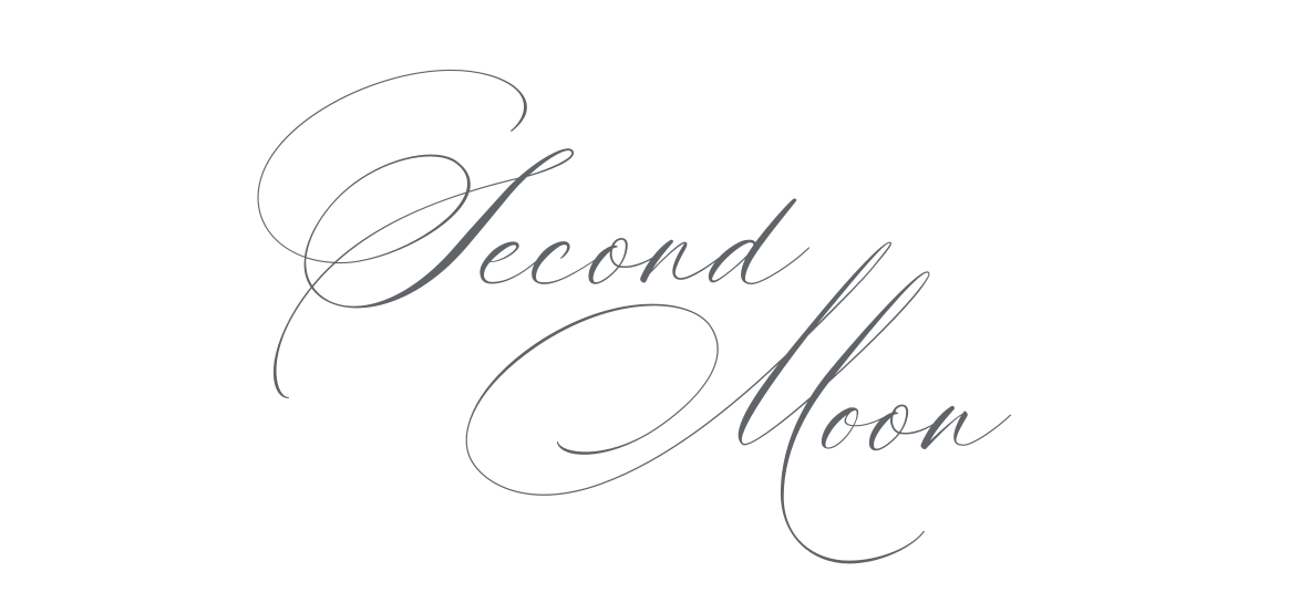
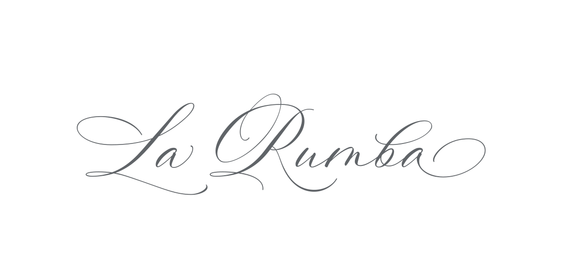
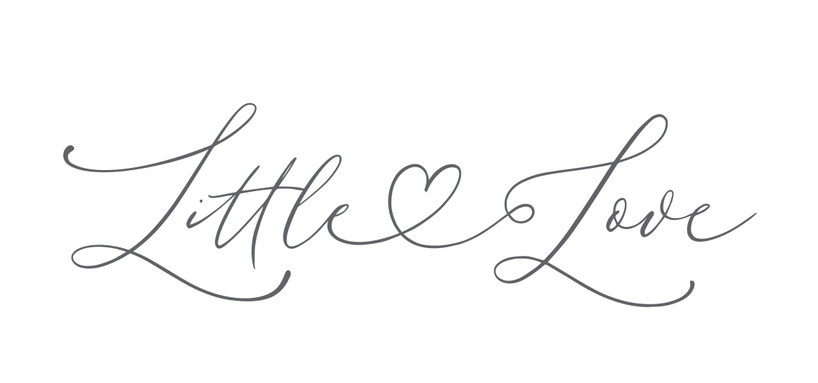
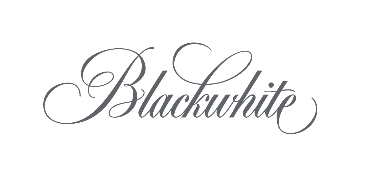
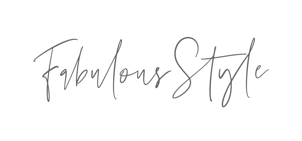
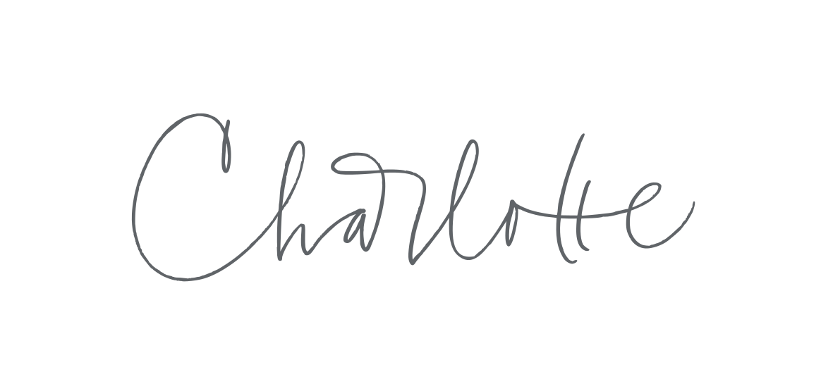
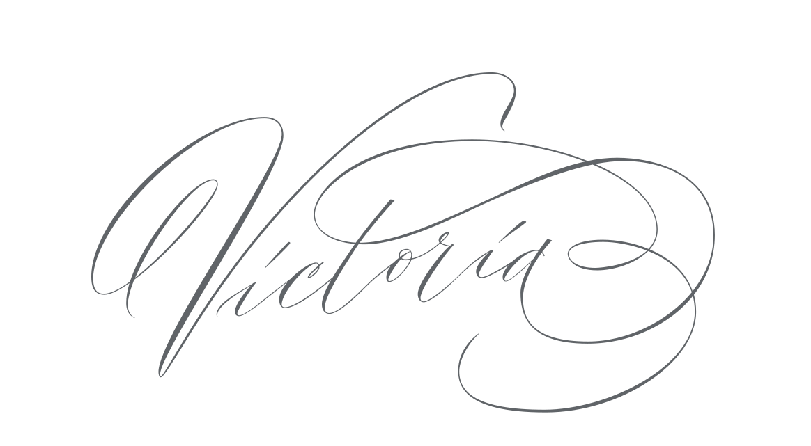
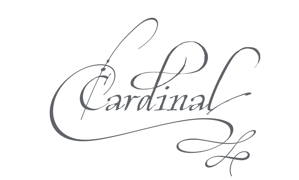
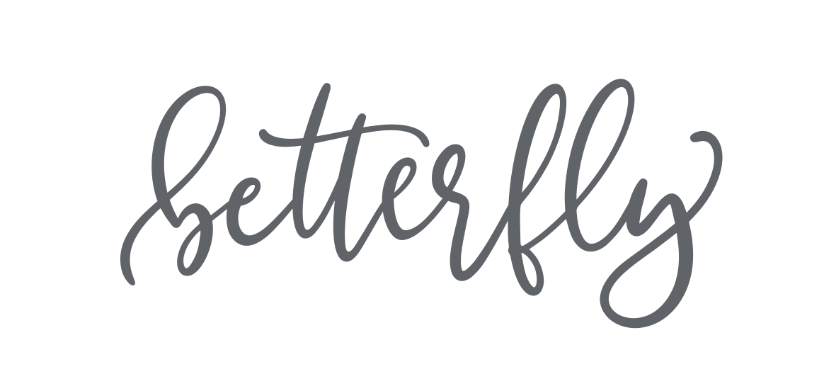
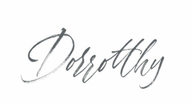
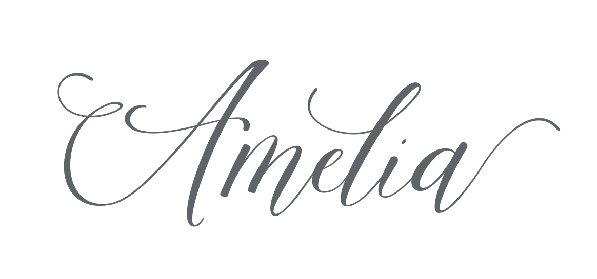
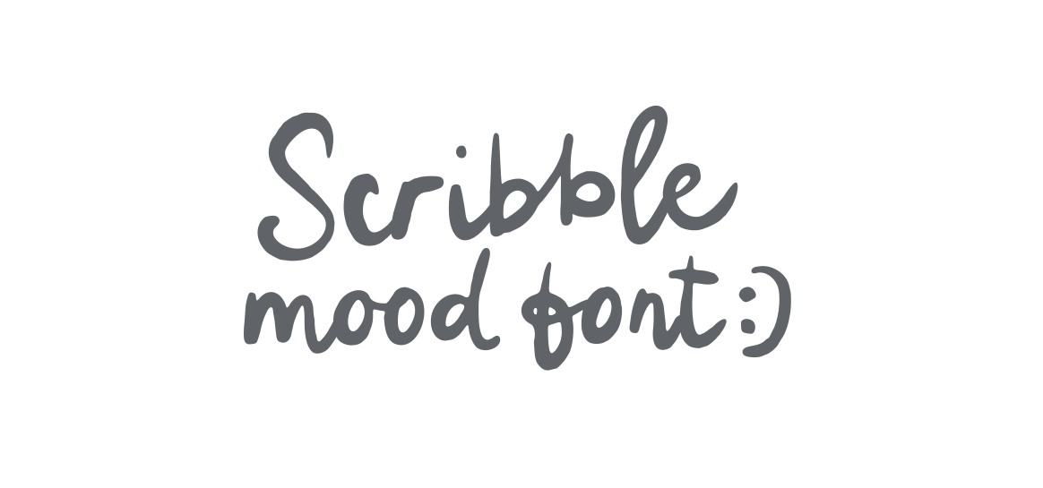
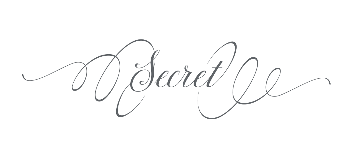
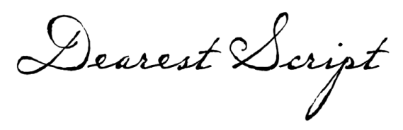
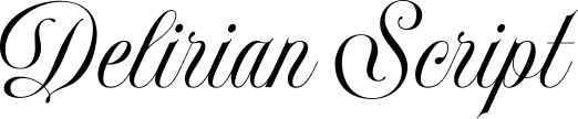
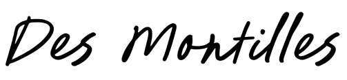
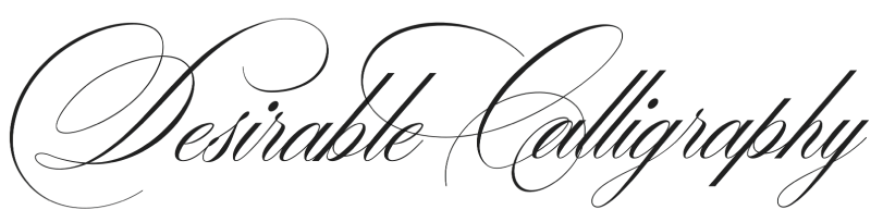
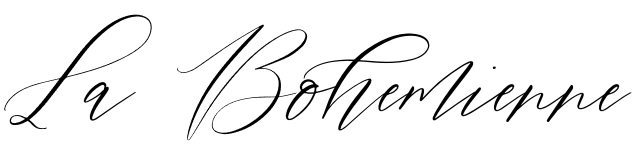
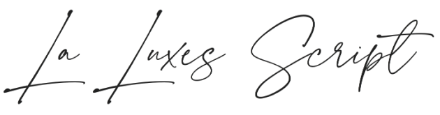
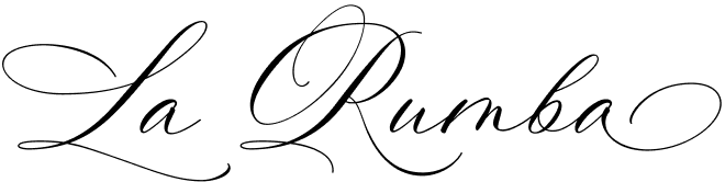
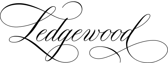
I have brought together 100 script and calligraphy fonts for wedding stationery, from traditional lettering with elegant flourishes to lighter, contemporary handwritten styles. Most are paid fonts, and each preview links to its designer or shop so you can explore the details and check the licence.
Choose 10 fonts and give each a place, then submit your list to see Most Popular.
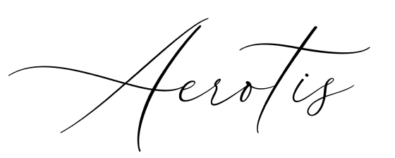
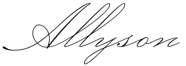
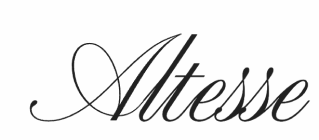
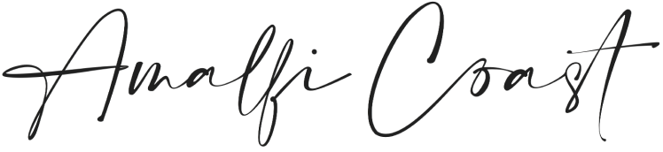
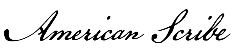

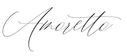
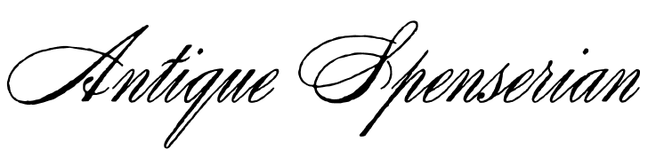
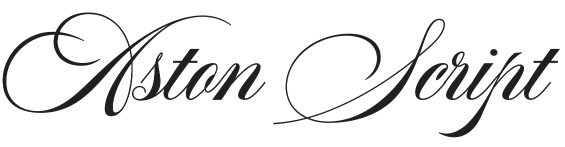
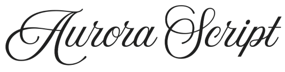
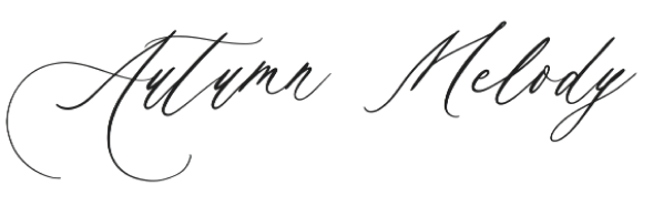
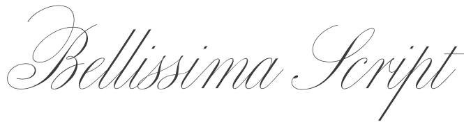
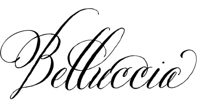
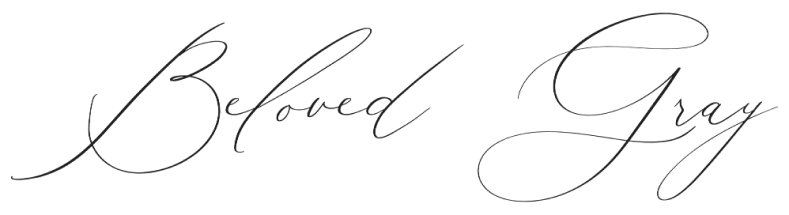
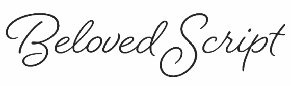
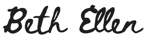

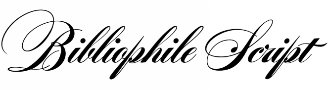
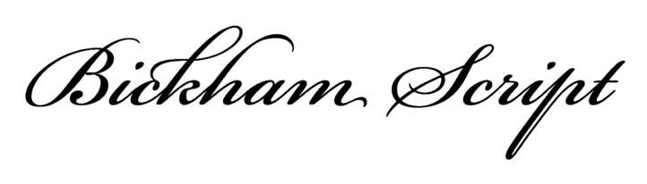
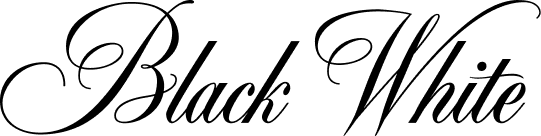
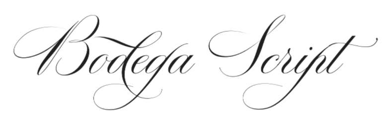
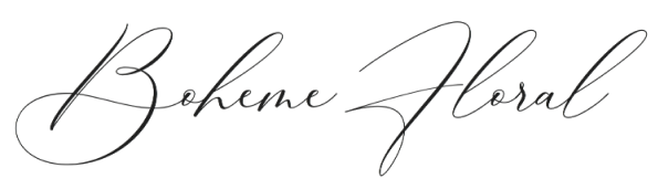

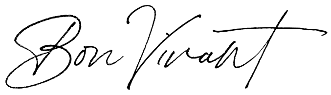
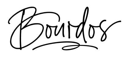

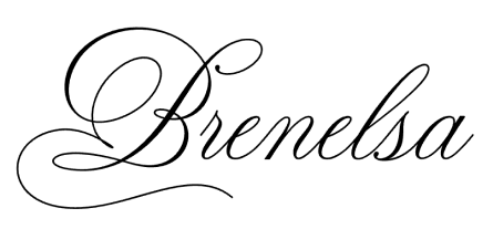
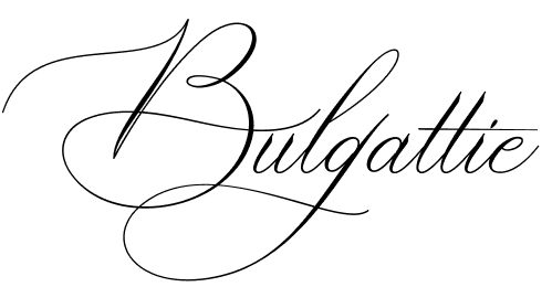
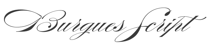
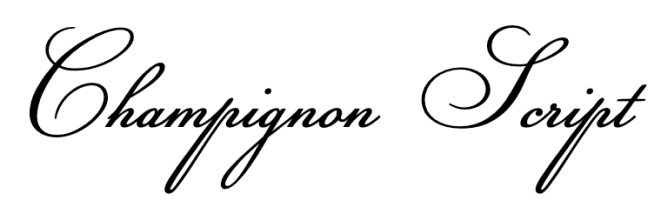
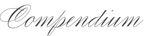
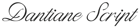
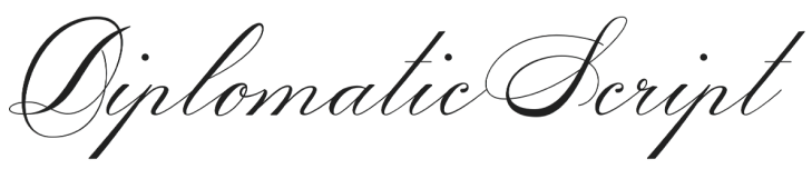

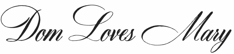
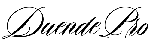
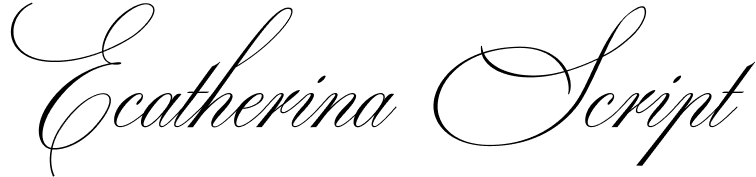

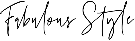
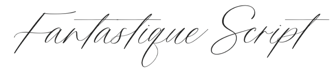
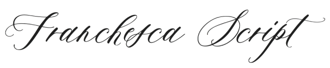

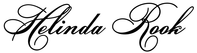
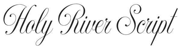

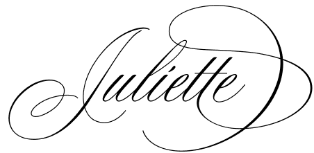
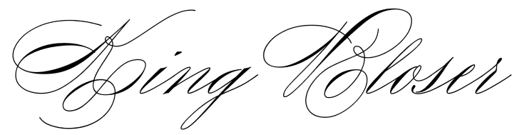
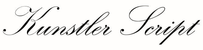
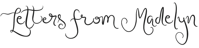
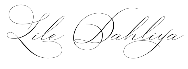
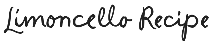
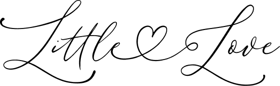

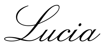
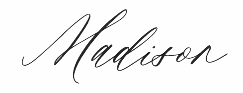
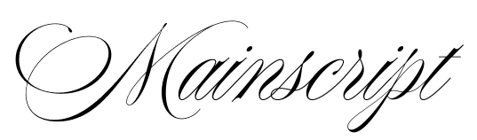

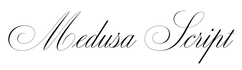
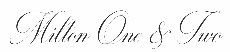


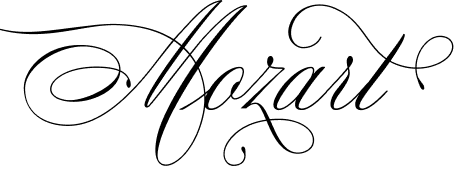
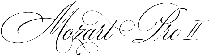
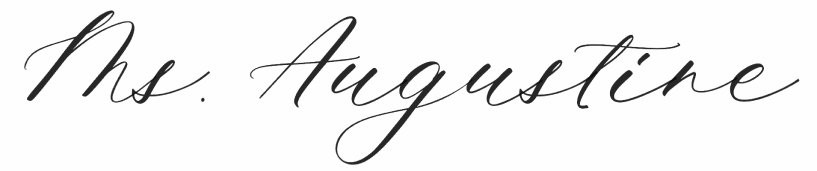
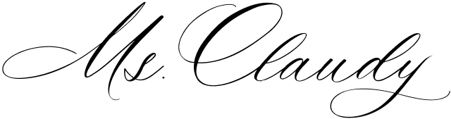

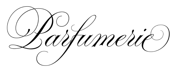
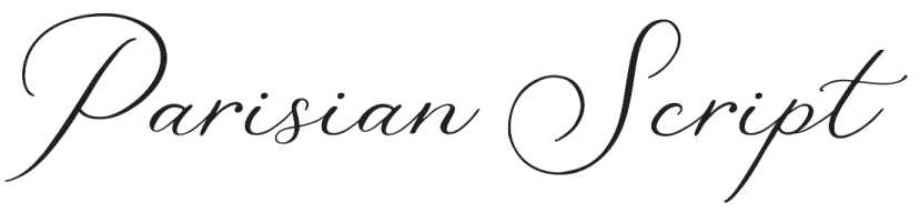
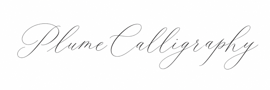
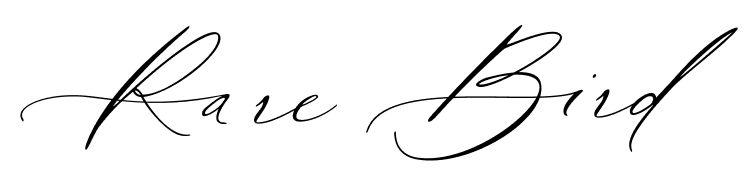

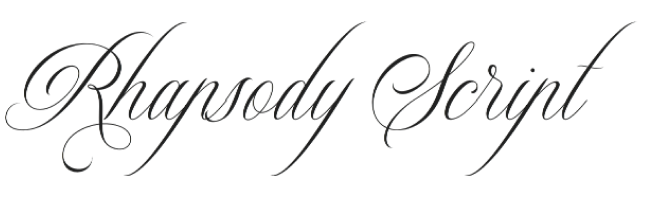
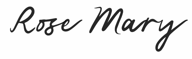

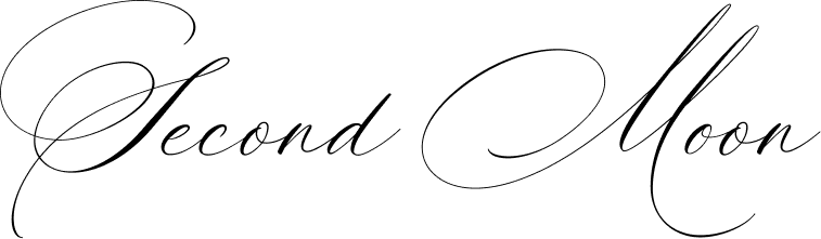
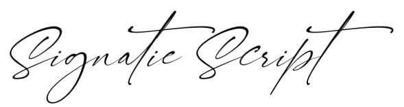
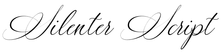
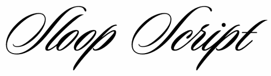

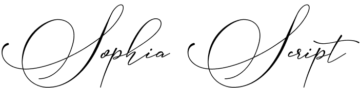
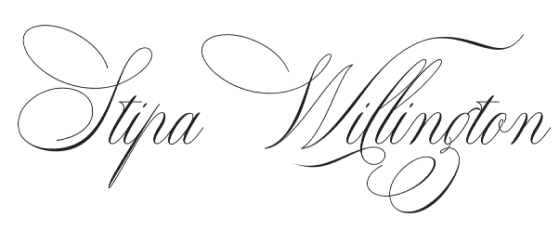
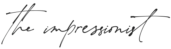
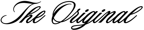

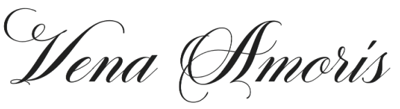
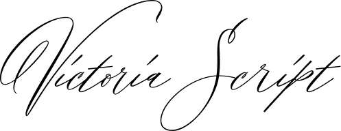

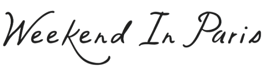

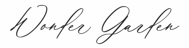
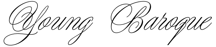
No matching fonts. Try another name.
Each top 10 awards 10 points to first place, down to 1 point to tenth. Most Popular shows the combined ranking; vote counts show how many people selected each font.
A few things to look for
Before exploring the collection, here are eight practical considerations to help you choose a font that is as enjoyable to use as it is beautiful.
01Choose a font that makes you feel something
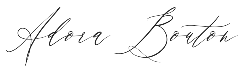
A font is one of the first things we notice on a wedding invitation. Two beautifully written names can be enough to suggest the mood of the celebration: formal and traditional, light and romantic, or relaxed and handwritten. Before buying a font, imagine the couple’s actual names in it, paying particular attention to the capitals. Their shapes often set the tone for the entire invitation.
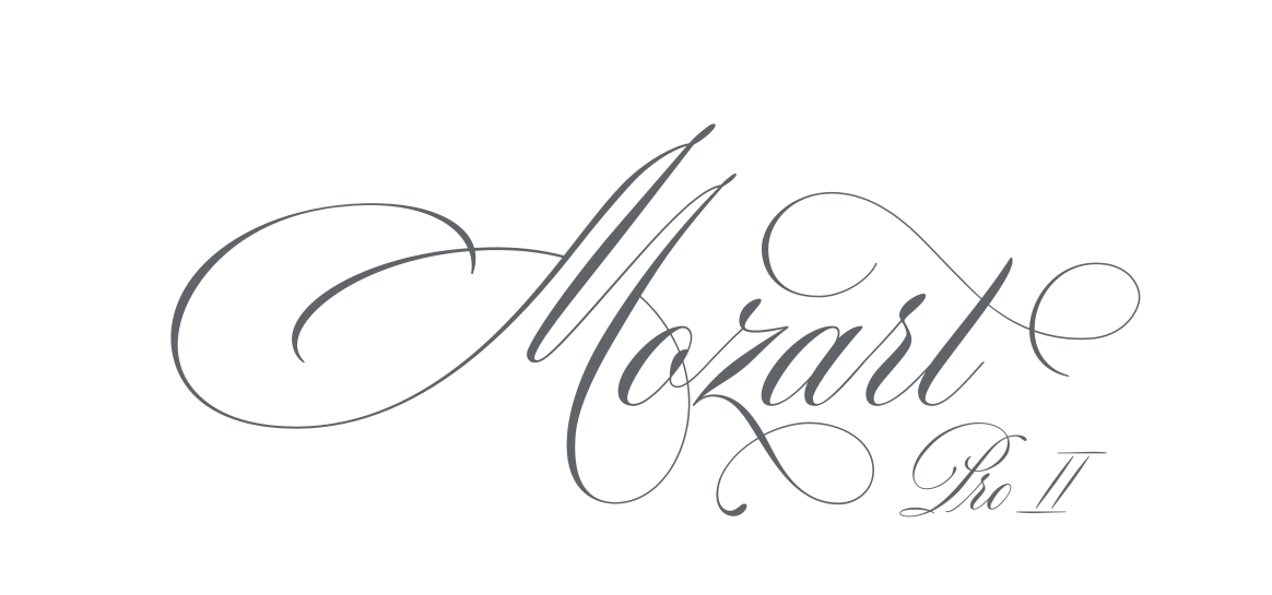
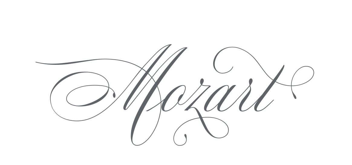
My Mozart Script has become a favourite among Blessed Print wedding designers for its elegant letters and long calligraphic flourishes. Later, I created Mozart II Pro, keeping that character while adding more ways to personalise the lettering.
02What are alternate letters, and why do they matter?
A professional script can offer much more than A to Z. A capital A might have a simple form, a sweeping entry stroke, a decorative loop or an extended flourish. These variations are called alternates. Swashes add decorative strokes; ligatures join two or more letters into a specially drawn shape; contextual alternates change letters according to their neighbours or position.
Imagine setting “Olivia & James” in several compositions without changing the font. That is where lettering becomes especially creative. In Mozart II Pro, many letters have numerous alternatives that can be selected with combinations such as a1, a2 and a3. If you design custom stationery, look beyond the cover image and check which alternates and features are included. One versatile family can sometimes do the work of several simpler fonts.
03Why do wedding font prices vary so much?
You may find a font for $15 and another for $100 or more. Creating convincing calligraphy takes time: letters need to look beautiful individually and connect naturally in words. A designer may spend months drawing alternates, ligatures, punctuation and additional styles, then programming the OpenType features that make them work.
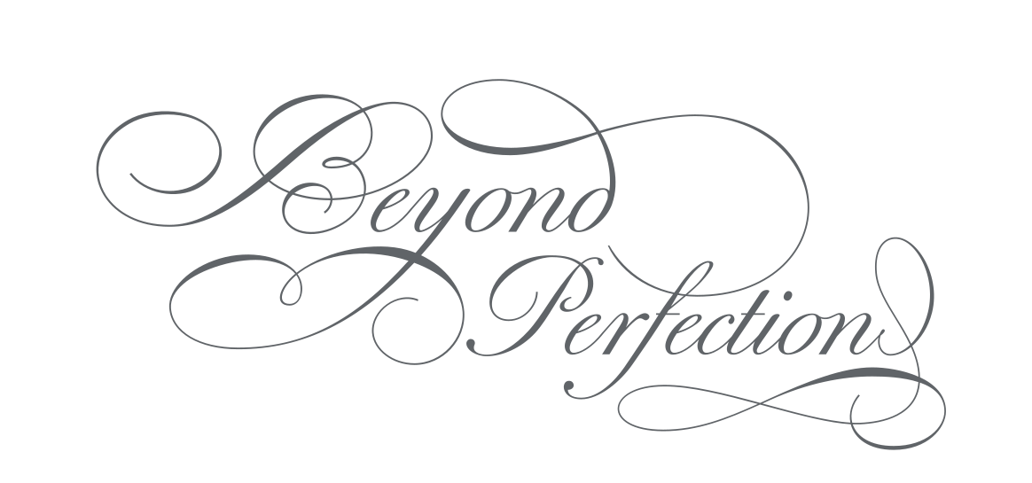
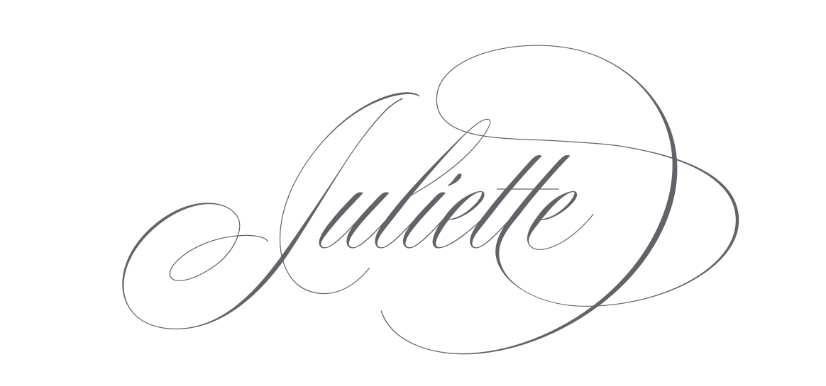
A higher price does not automatically make a font better for your project. A straightforward font may be enough for one invitation, while professional stationery designers may benefit from a wider range of choices. My Juliette and Beyond Perfection, for example, offer extensive calligraphic alternatives. Choose for your style and workflow, rather than price alone.
04Which font licence should you buy?
A beautiful font and permission to use it are different things. Start with your intended use: invitations for your own wedding may qualify for a personal licence, while client work needs permission for commercial use. A desktop licence often covers finished printed and digital designs, but every foundry sets its own terms.
Editable templates deserve particular attention. Selling designs in Canva, Templett or Corjl, where customers edit the text themselves, may require a separate licence or may not be allowed at all. Check the terms before purchasing and consult the Blessed Print licence guide for our current options. Technical ability to upload a font does not grant permission to redistribute it or sell editable templates.
05Which design programs can you use?
Most contemporary fonts arrive as OTF or TTF files and work in many design applications. Supporting a font file, however, is different from supporting every typographic feature. Illustrator and InDesign provide tools for selecting alternate glyphs and ligatures, while simpler editors may expose fewer options.
If you are buying a font specifically for its alternate letters, first check how to access them in your chosen program. Some Blessed Print fonts offer number combinations or special characters to select additional forms without a full OpenType panel. Check the individual font’s instructions rather than assuming that every family works in the same way.
06Can you use purchased fonts in Canva?
Yes, provided your Canva plan supports custom font uploads and the font’s licence permits your intended use. Uploading the file lets you set names and experiment with layouts, but access to advanced OpenType controls can differ from desktop design software. Check the font’s instructions and test the alternatives you need.
Creating an invitation for your own wedding is different from selling an editable Canva template. Always confirm the licence before offering templates to customers. Our font help centre includes instructions for working with Blessed Print fonts.
07What if the calligraphy looks too thin in print?
Fine hairlines can look beautiful on screen and become difficult to see at small sizes or on textured paper. Adding a small outline or stroke can make letters heavier, but an automatic outline may also change their shapes and disturb delicate connections. Print a sample at the final size before ordering the full run.
For some of my fonts, I draw versions with stronger thin strokes. Mozart II Pro includes Ex1 and Ex2 variations designed to make delicate details more visible while preserving the character of the calligraphy. Compare the options on your actual paper and with your printer.
08Do not use calligraphy for every line
Expressive scripts work beautifully for the couple’s names, short headings and accents. Dates, addresses and ceremony details are usually easier to read in a simpler typeface. I especially enjoy pairing flowing calligraphy with an elegant serif: the invitation keeps its romantic mood without asking readers to decipher every line.
Try a few combinations and compositions before deciding. Sometimes one beautifully chosen letter changes the feeling of the entire design.
Find the font that feels like you
I hope this collection introduces you to new designers and helps you find the lettering that makes your invitation feel special. Experiment with alternate letters, pair different styles and try a few compositions. Sometimes, a single beautifully drawn letter is all it takes.
Some links are affiliate links. I may earn a commission if you purchase through them, at no additional cost to you.