How Artificial Intelligence Helped Me Create Ledgewood Script
The story behind Ledgewood Script — a little about creativity, self-doubt, and how new technology has changed the way I work.
For Those Who Love a Good Story
Creating a new typeface is always a big challenge for me. And even though I’ve been doing this for years, I still find myself going through the same stages every time. First comes the search for an idea, followed by endless experiments, doubts, revisions, and finally, that moment when you realize everything has come together.
Perhaps the hardest part isn't even the drawing itself, but the uncertainty. You can spend months working on a typeface only to discover that nobody really needs it. In my case, that uncertainty feels especially personal because designing fonts is my family's only source of income.
On the one hand, when I'm drawing, I don't think about how much money I might make. I simply love the process. I can spend hours searching for just the right shape of a single letter. On the other hand, I know perfectly well that all this work eventually has to pay off.
Perhaps that's one of the hardest parts of my work — remaining an artist while also having to be an entrepreneur.
By the way, for those who don't know, I live in Moldova. It's a small country between Ukraine (God help Ukraine stand strong!) and Romania. This is where I create my fonts, which are then used by designers in different corners of the world.
How It All Began
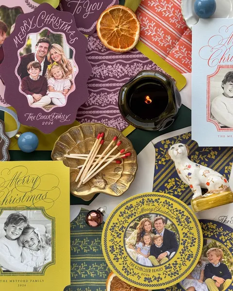
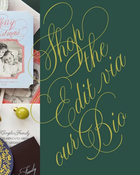
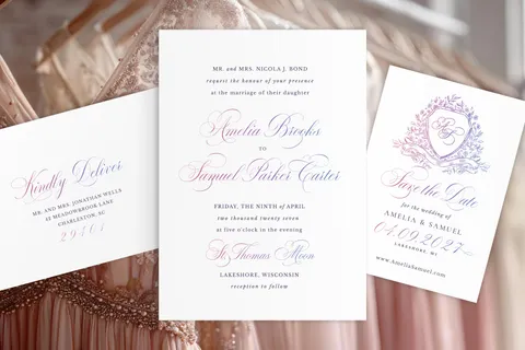
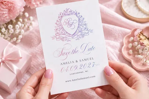
I absolutely love seeing how stationery designers use my fonts. They're all so different, each with their own style, favorite combinations, and sense of beauty. Sometimes I can spend ages looking through their work, amazed by how differently the same typefaces can be used.
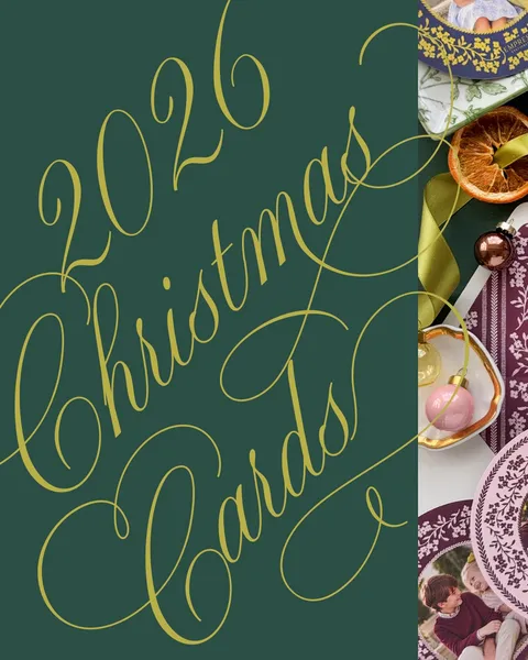
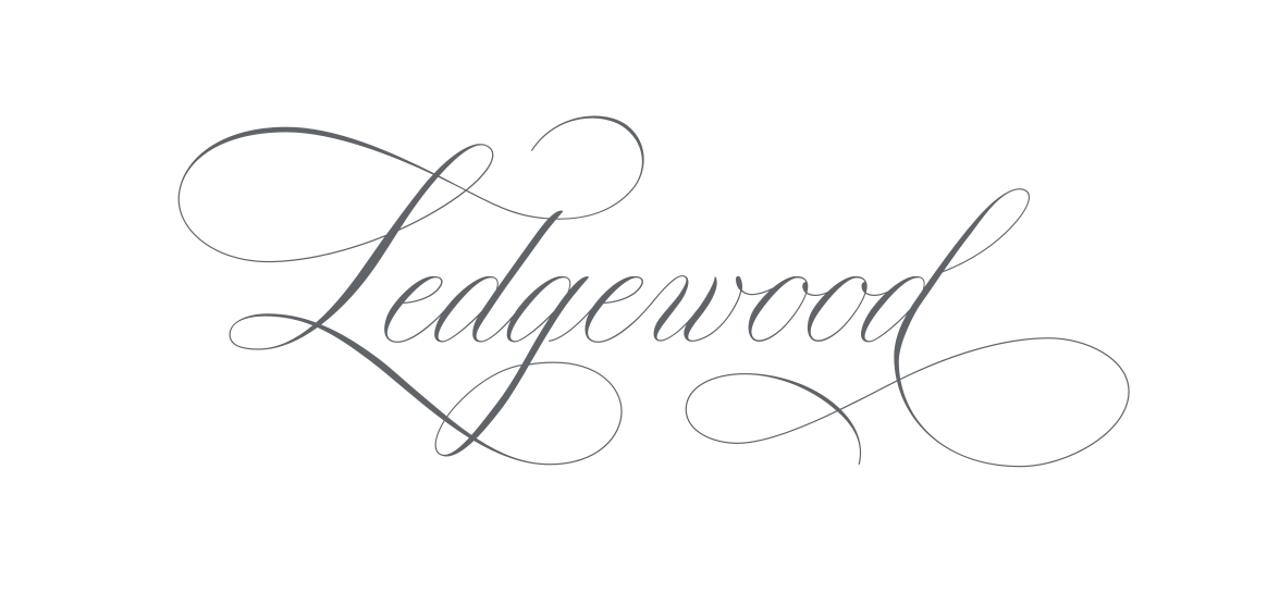
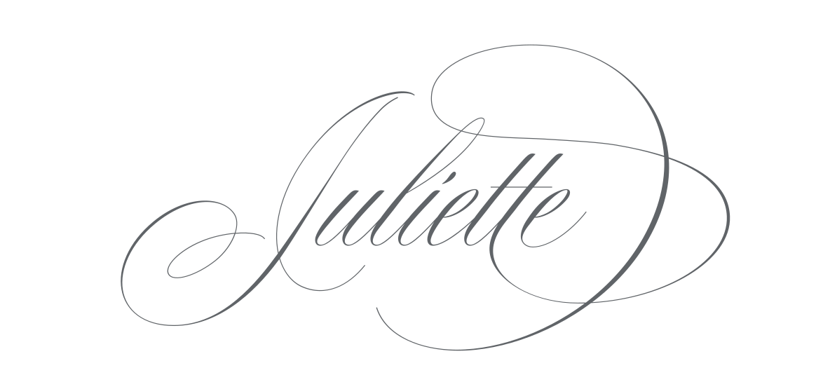
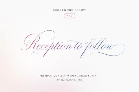
One day, I received a message from Frances, one of my longtime customers. She's been using my fonts in her designs for years, and I've always enjoyed following her work. Frances suggested naming my next typeface Ledgewood. Why not? I thought. And that's how we started exchanging ideas!
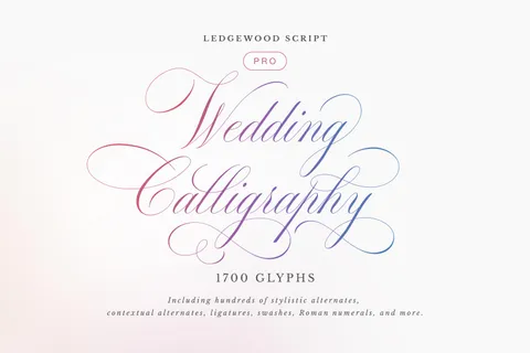
I took a much closer look at Frances's work, trying to understand what connected her designs and the feeling behind them. At some point, an image of the future typeface began to take shape in my mind, something that echoed her feminine style, both as a public personality and as a designer who creates truly beautiful work.
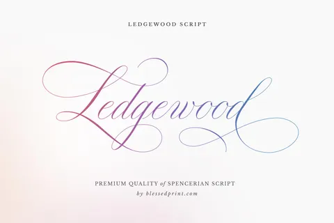
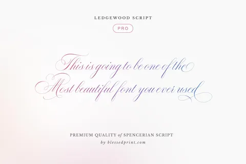
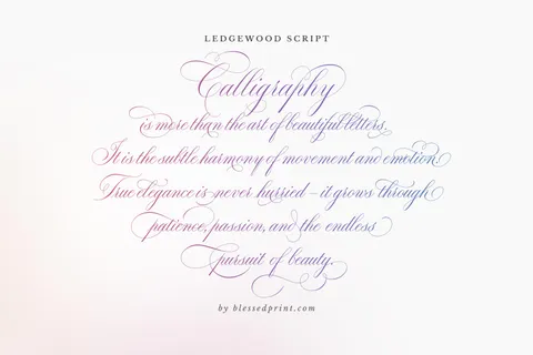
And now, after three months of work, Ledgewood is finally ready!
How Do I Draw My Fonts?
Whenever someone asks me how I design fonts, I always say that every typeface has its own story. Sometimes, after a while, I even forget exactly how I created a particular font. I get so completely absorbed in the creative process that I occasionally wonder: Am I really the one doing this, or is the work somehow happening through me?
I love that feeling. I think other artists will understand what I mean.
But there's one thing you definitely can't leave to chance: choosing your techniques and tools. That's something you need to figure out right from the beginning.
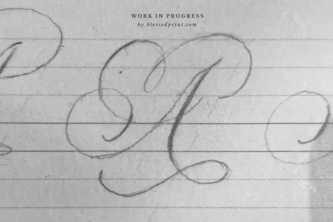
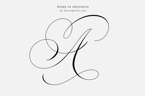
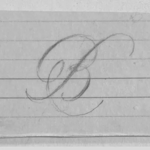
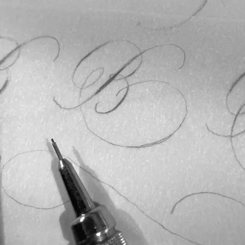
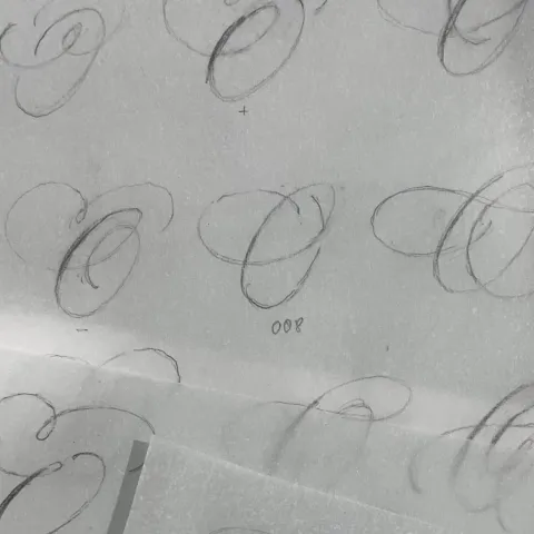
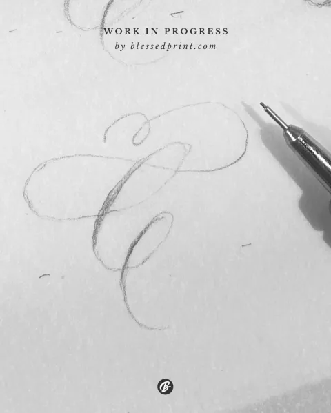
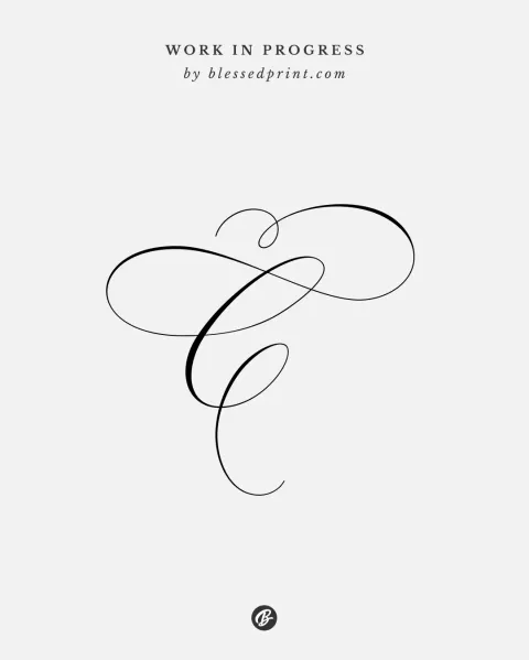
I deliberately drew all my Ledgewood sketches in pencil. Every main idea first appeared on paper, and I used my favorite tracing-paper technique. I would layer one sheet over another, refine an idea, adjust the shapes, and gradually find what I was looking for.
I love this approach because nothing limits you. There's only a pencil, paper, and an idea. And the most important thing is to capture the right feeling. Everything else can come later.
When Will AI Learn to Design Fonts?
People often ask me when AI will replace me. My answer is always the same: NEVER!
Well, at least that's what I believe.
In fact, I don't think AI will ever be able to completely replace a true artist. Technically, it might be able to imitate something, invent something, or recreate a particular style. It might even produce something incredibly beautiful. But can it truly experience the entire creative journey that a human being goes through? Can it feel doubt, inspiration, or the joy of unexpectedly discovering the perfect solution?
For me, creativity isn't just about the final result. It's also about everything that happens to you while you're creating something new. And that's what I love most about my work.
Of course, there's another question: What happens if people eventually lose the ability to distinguish human creativity from something made by a machine? Now that's a genuinely interesting question. And probably not just for type designers.
But do you know what's most surprising? Despite everything I've just said, artificial intelligence has already helped me enormously. In fact, it has changed my workflow so much that I still find myself amazed by it.
And this is where the most interesting part of the story begins.
How AI Helped Me Work Faster
Designing fonts involves a huge number of repetitive tasks. Of course, I spend most of my time drawing, and I absolutely love that part. But there's another side to the process: manually drawing every letter as a vector in Glyphs, working with nodes and handles, renaming glyphs, adjusting technical settings, performing various operations, preparing files for export, assigning PUA values to glyphs, creating reusable letter components to avoid duplicating the same elements, writing documentation and help guides, building product pages for my website, and dozens of other things that need to happen before a font is ready to sell.
To be honest, for several years I'd had ideas for tools that could make this work significantly easier. I could picture exactly what they should look like, what they should do, and how I wanted to use them. There was just one problem. I'm not a programmer.
So, guess what happened? One day, I decided to ask ChatGPT whether it could build a tool for me that would work directly inside Glyphs.
I attached sketches of my idea, explained how I wanted it to work, and described the problems I was trying to solve. Just five minutes later, I had the first version of the tool. And the most amazing part? It worked on the very first try!
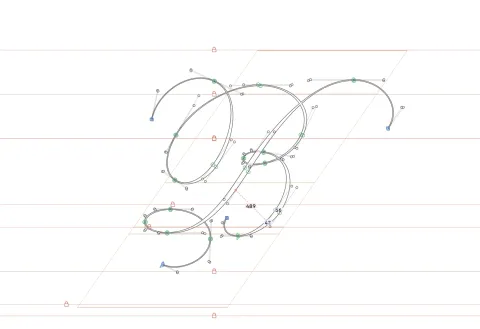
Of course, I continued improving it afterward, changing things here and there and adding new features. But the fact that I could finally bring to life an idea that had existed only in my head for years absolutely amazed me.
That's how my very own tool came to life. It saves me thousands of unnecessary clicks, and now I can hardly imagine going back to working with only the standard tools in Glyphs.
I Saved Weeks of Work With AI
Once I started using my first tool, I immediately fell in love with it. As I worked, I kept improving it. Then I began wondering: If I could do this with one tool, why not try automating other tasks too? Gradually, I started creating different scripts and plugins that could save me hours of manual work with just a few clicks.
For example, preparing a font repertoire — a document spanning dozens of pages that showcases all the letters and their alternates — used to take me up to two full days. I had to arrange everything manually, align the elements, check the details, and format the pages.
Now I do it with my own Figma plugin, and most of the work takes just a couple of minutes! The first time I saw the result, I honestly couldn't believe it actually worked.
And these are just a few examples. In the past, adding a new font page to my website could also take hours of work. Now AI handles most of the technical tasks for me, and sometimes it feels almost like magic.
In the end, I haven't just saved a few hours. I've saved entire weeks of work.
Instead of spending my time on endless technical tasks, I can draw more, experiment, explore new letterforms, and focus on what I truly love.
How to Avoid Burnout and Keep Creating
When you're in the final month of working on a typeface, it's hard not to feel exhausted. Although, when you think about it, being tired doesn't necessarily mean you're burned out.
To be honest, lately I've occasionally caught myself wondering whether I might be experiencing burnout. Thank God, those were only passing thoughts. I think what I was really feeling was a need to change something about the way I worked.
And here's something I noticed. In the past, I often found myself delaying the moment when a font was finally finished. Not because I didn't want to release it, but because I knew exactly how much technical and repetitive work was still waiting for me. When you've spent months drawing letters and then have to switch to endless checks, documentation, and technical adjustments, it can be genuinely exhausting.
The closer I got to releasing a font, the longer the list of tasks became — and more and more of them had almost nothing to do with creativity.
But with the arrival of these new technologies, I suddenly realized that a lot of this could change.
These days, I try to optimize every new task that comes my way. I consult AI, look for ways to automate repetitive processes, and you know what? It's really starting to pay off.
What I've Done and What I've Learned
Thank you for reading my story! I wanted to share a little about how Ledgewood came to life and how my creative process has changed along the way.
I've heard so many stories about people, especially artists and other creative professionals, feeling discouraged by the idea that AI might replace them. But really, can AI replace the little piece of our soul that we put into the things we create?
On the contrary, I see AI as a wonderful assistant and a source of inspiration for new ideas. And in my own experience, it's also been an incredible tool for simplifying repetitive work.
I hope everyone finds their own creative spark and shares a little more love with their families and the people around them. And I hope my fonts can help make this world a little more beautiful.
One more thing: I absolutely love seeing how you use my fonts in your own designs. Please share your projects and tag @blessedprint. It's always such a joy for me to see your work!
Dmitrii, Blessed Print